Het Parool
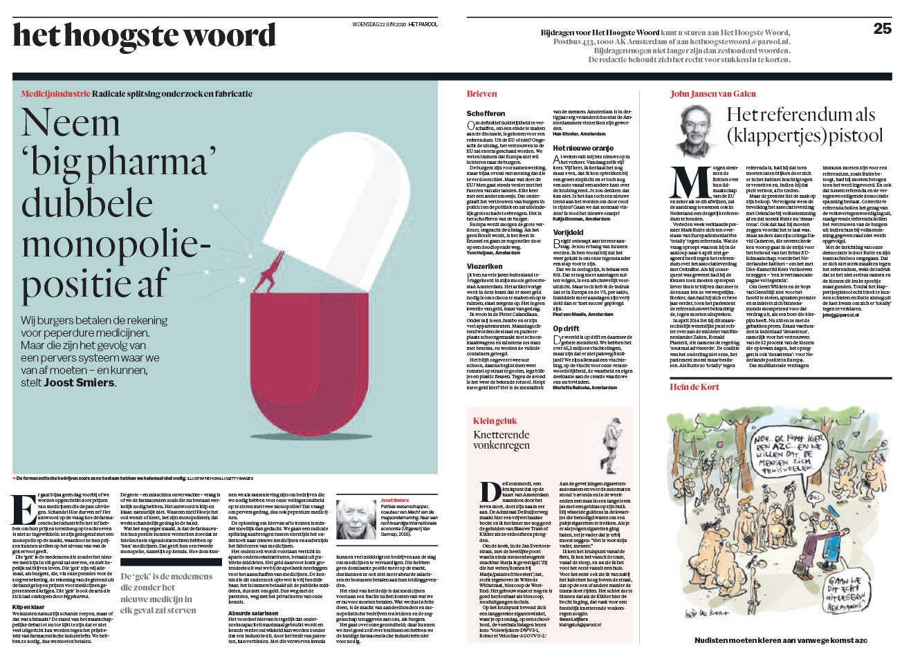
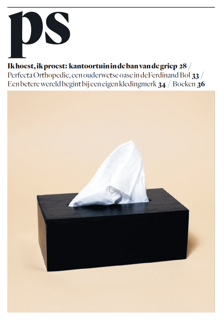
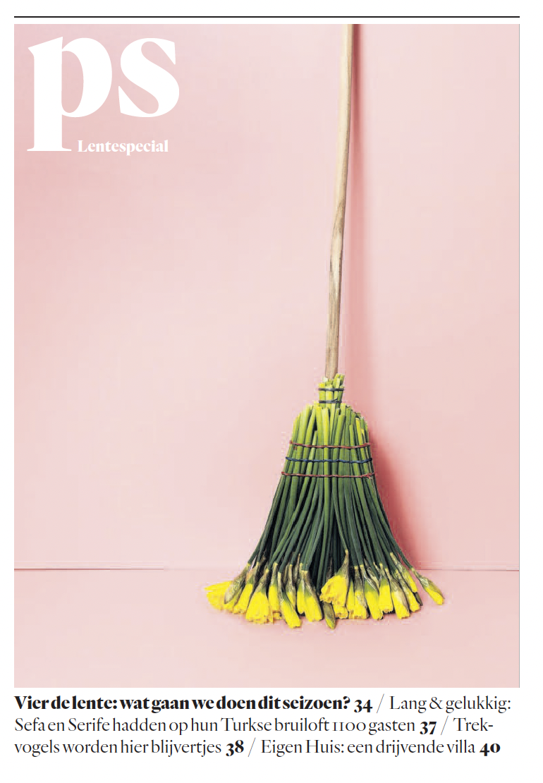
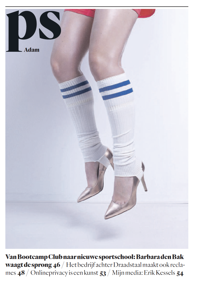
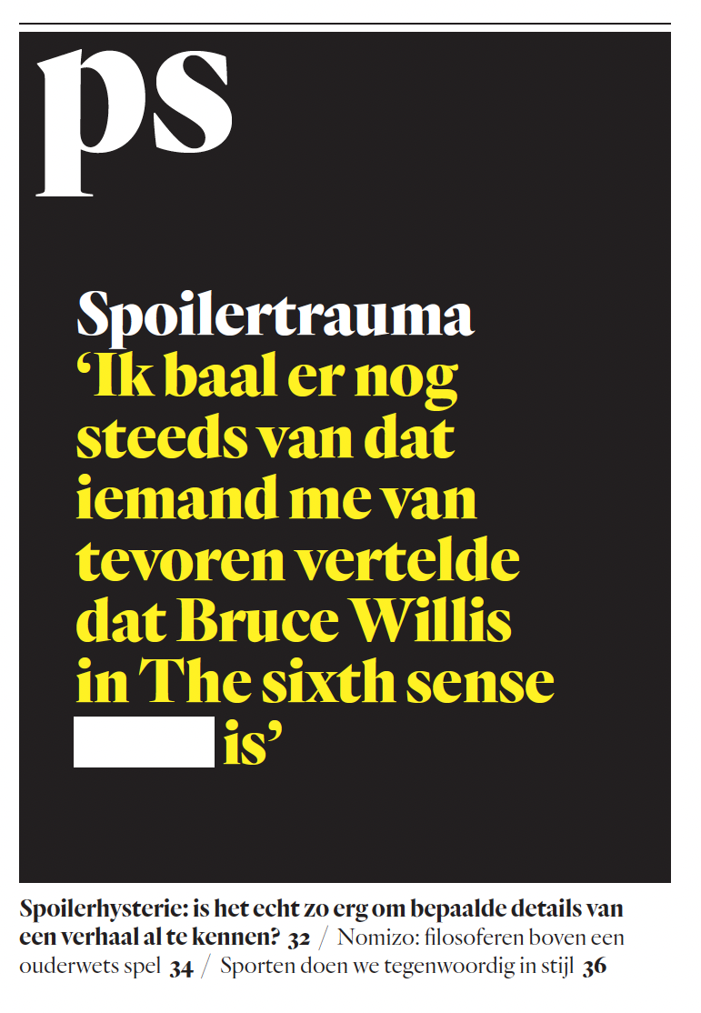
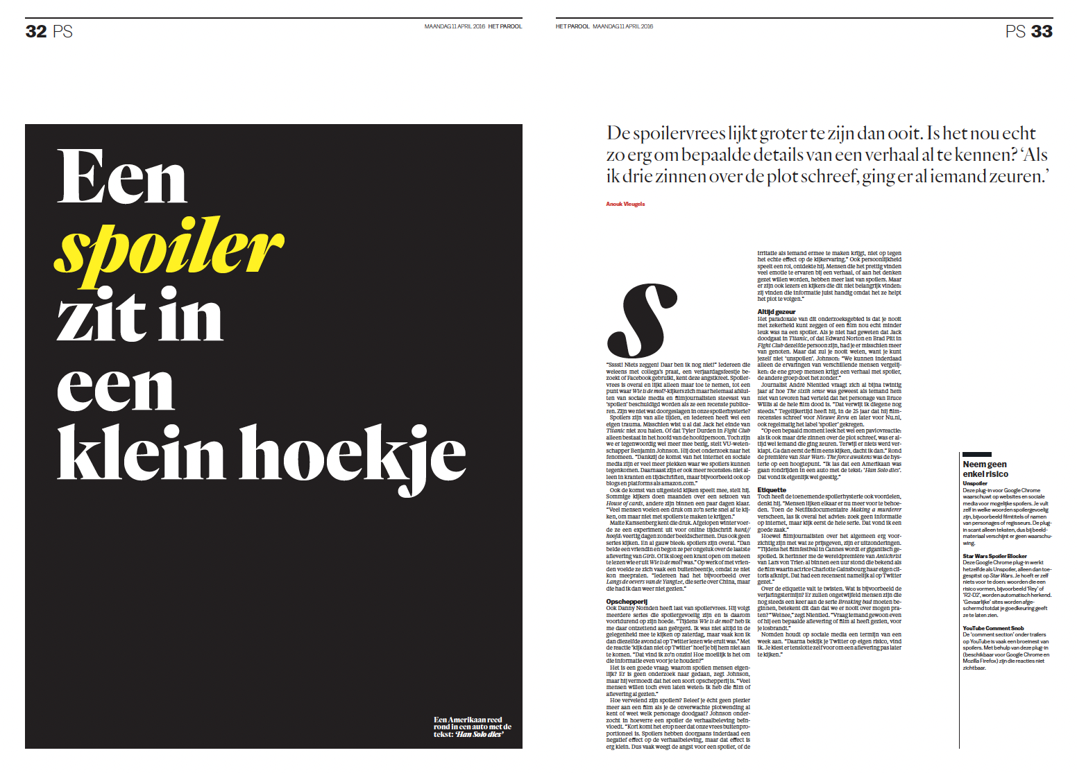
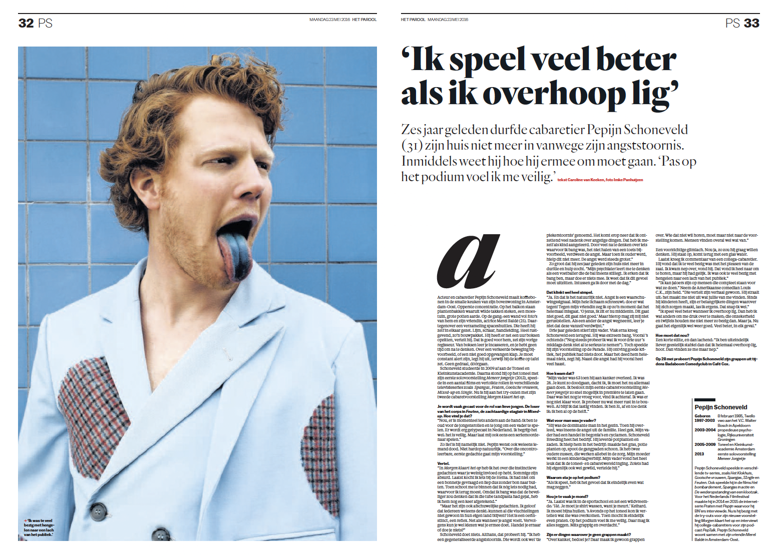
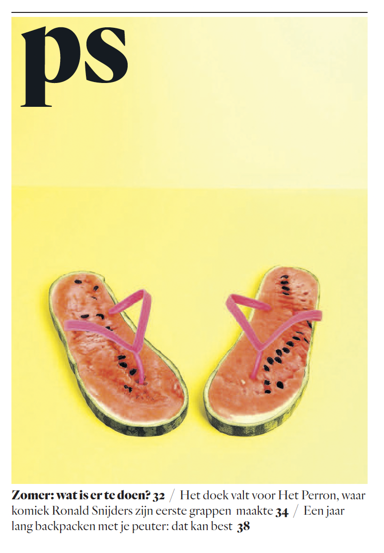
Amsterdam-based Dutch newspaper covering local stories. It was redesigned in 2016 and soon after won the top prize in Europe’s most prestigious design competition, European Newspaper of the Year (in the regional newspaper category). And in 2017, it won the prize for “World’s Best Designed Newspaper,” the highest design honor a newspaper can achieve. A newspaper offering extensive coverage of national and international news, politics, and other important events. The city’s news, culture, and opinions are the main focus. This journal that began as a resistance publication during World War II’s underground became the most popular and influential in Holland. Our primary goals in the latest revamp were the following. On the one hand, to update it to reflect the taste of the city and its readers, who are a creative bunch in Amsterdam, enthusiastic about art, design, and culture. And at the same time, we choose to pay homage to the paper’s illustrious past by giving it the look and feel of a classic newspaper from the 1950s or 1960s. That’s why we combined a cutting-edge visual layer with classic, black-and-white serif fonts.
Website design was a part of the project. Was based on print style and typography: www.parool.nl
Art directors: John Koning, Floor Koop
Task
Rebuild a unified visual system for the advertising agency, made of steel which can change the world in a while.

