AD
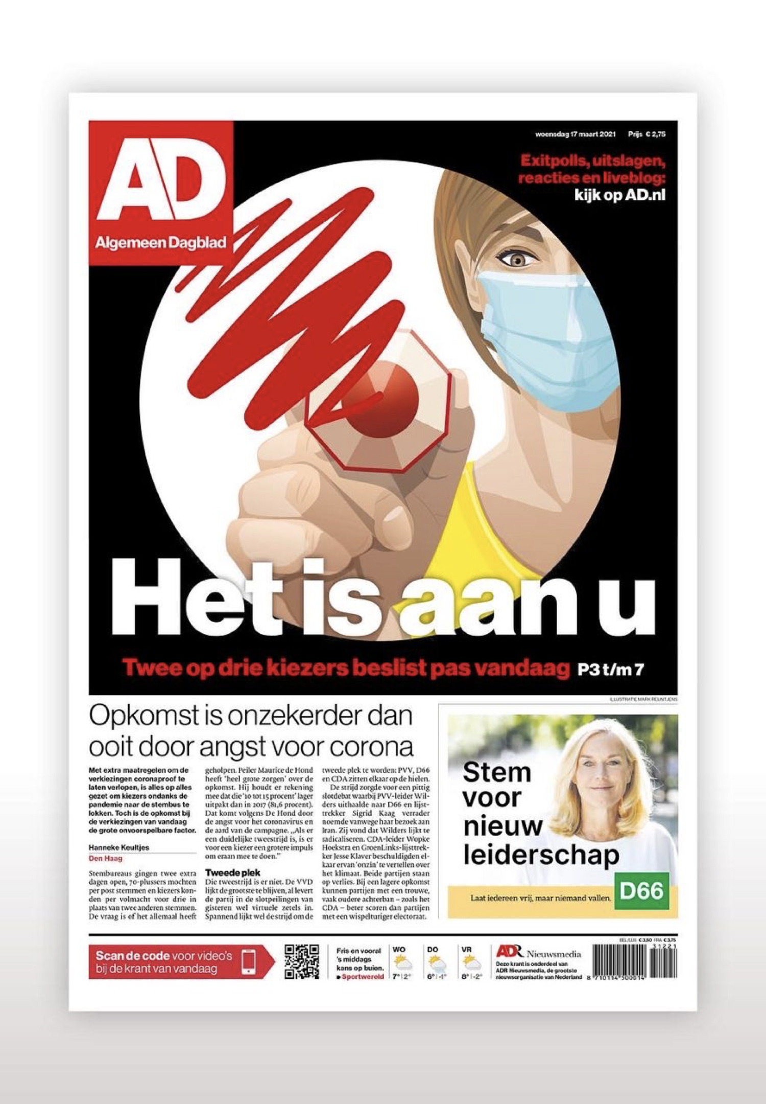
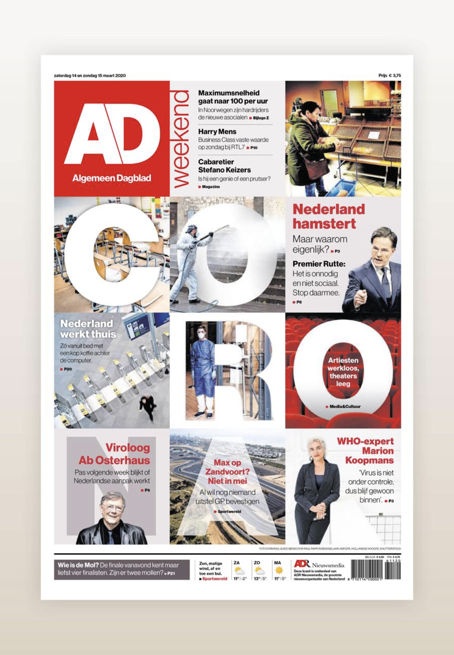
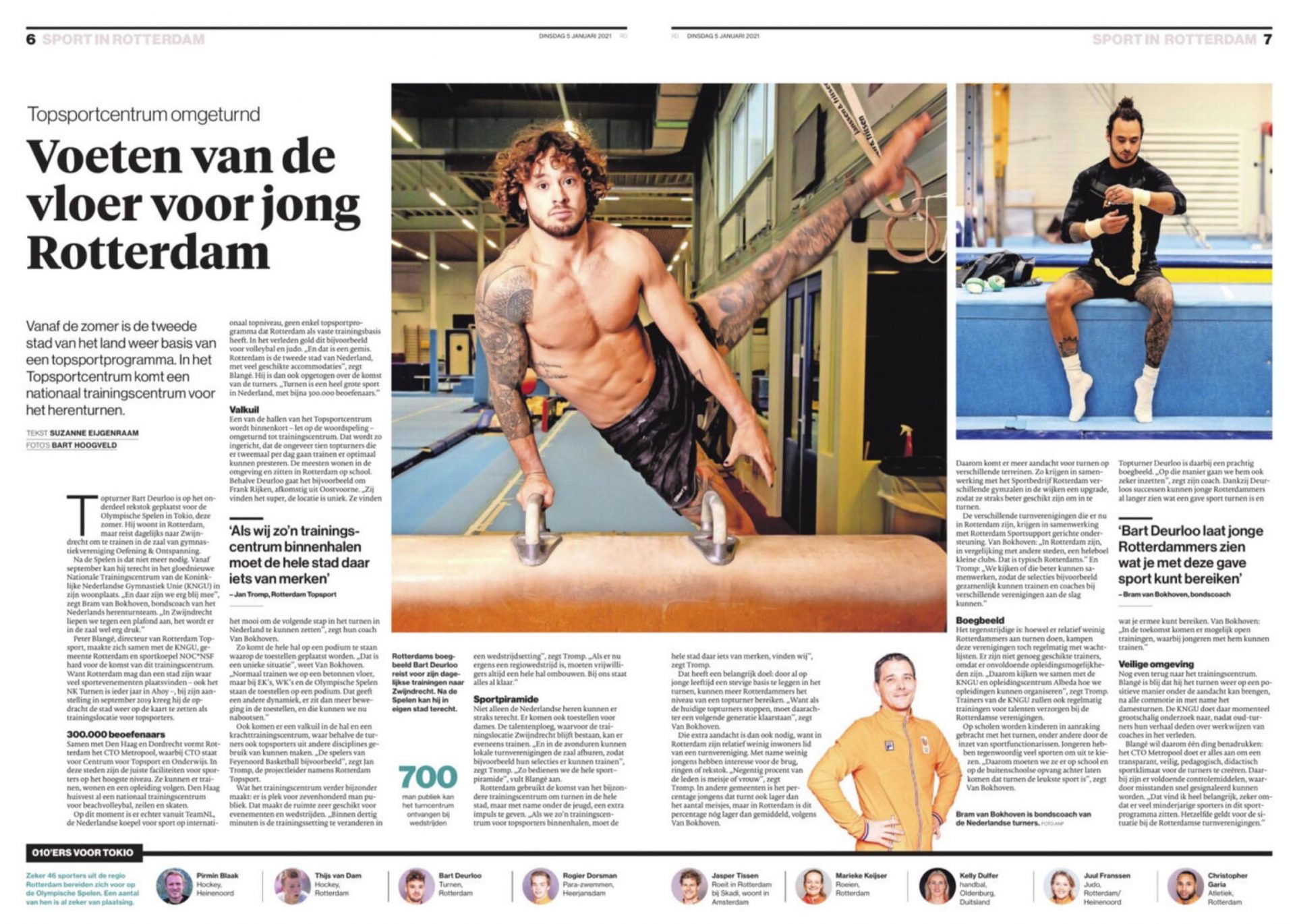
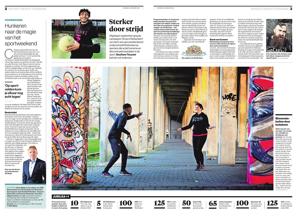
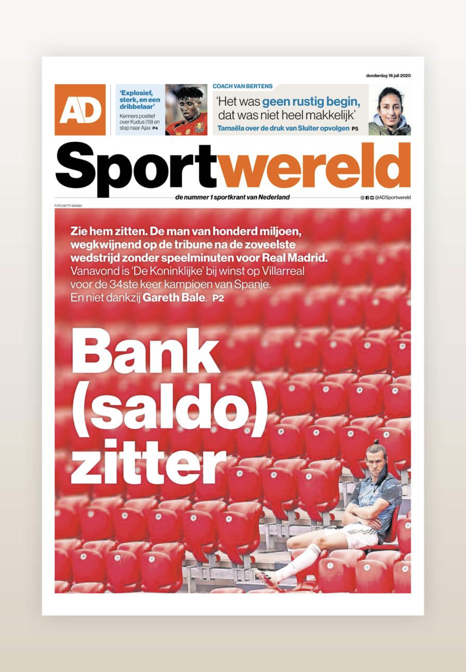
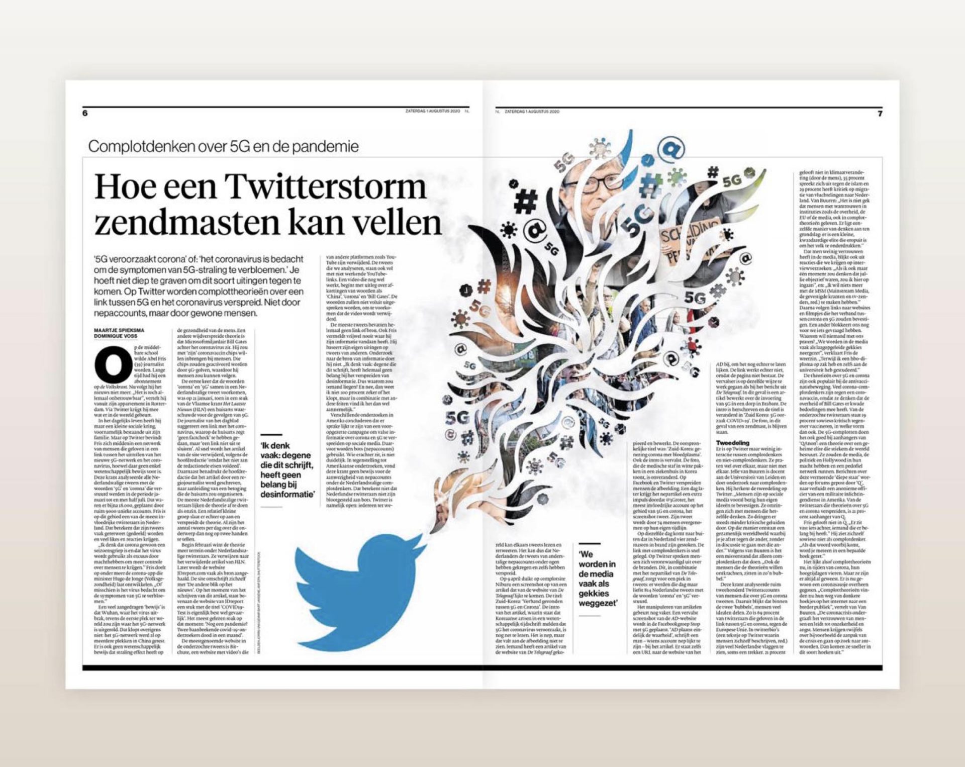
Redesigned in 2016 as part of an initiative to unify the looks of several Dutch regional dailies. As a result, I went with a traditional sans serif font, which will be both authoritative and timeless. The newspaper’s sports section is excellent, featuring numerous infographics. The same design was applied to all newspapers in several cities in the Nederland. This is the biggest chain of local newspapers in the country.
AD art director: Karin Goedhart
Sport section designer: Jeroen de Haas (now designer of the whole newspaper)
Task
Rebuild a unified visual system for the advertising agency, made of steel which can change the world in a while.
